
In this project I was tasked to rebrand an existing company, I came across the Silvestre Gusto Latino, a peruvian restaurant, it was located on Water St. on Downtown Vancouver. As a person that has grown up in a hispanic enviroment, I really liked the hispanic vibes inside the restaurant, the staff's also speak spanish, which im more familiar. So I choose the restaurant to rebrand.
I began doing an research and analysis on the demographics, brand story, SWOT and competitor analysis, etc.. I came into conclusion that the restaurant had a lot of problems that neeeded to be solved, such as the customer service, consistent food quality,
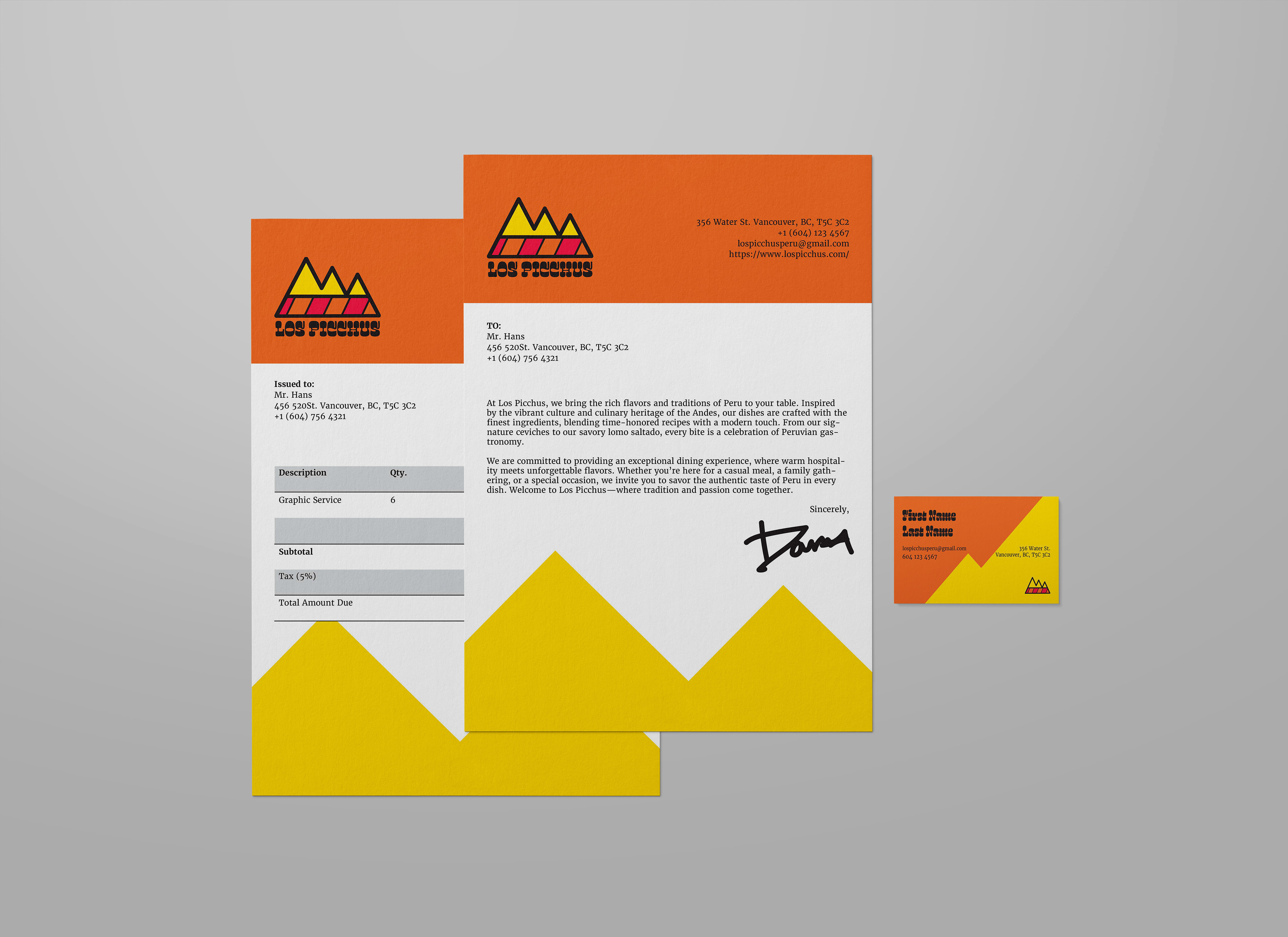
With all the research done, I named my design "Los Picchus" playing with the spanish and having peruvian touch to it. "Los Picchus" means "The Mountains", "Picchu" is used in the traditional indigenous language referring to "Mountain"
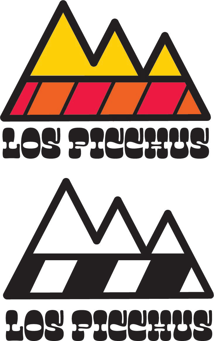
Logo
The textile patterns of the mountains are inspired by the peruvian textile, peruvian textile have unique patterns. The mountain shape is inspired by the name of the restaurant Picchus (Mountains). Peruvian textile have very bright and colorful colors, which makes one unique to another.
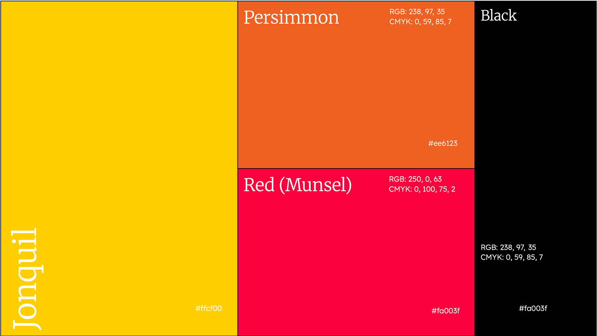
Colours
I chose bright colors as bright colors are used a lot in traditional peruvian textiles. Hispanic people tend to use bright colours. Peruvians used natural dyes for the textiles, and each unique textile was made to convey an specific message.
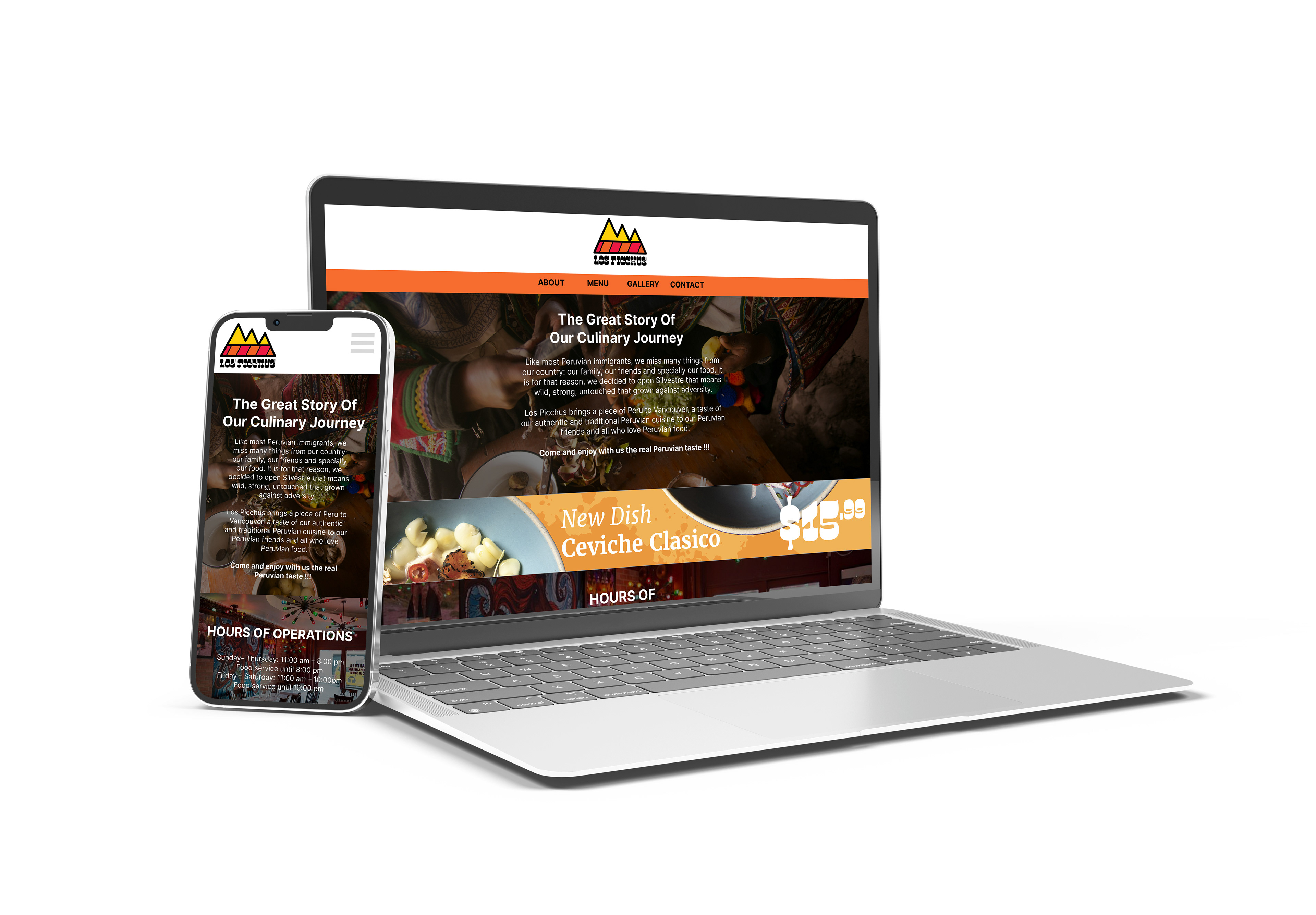
Website
For the website, the viewer lands directly with an introduction of the restaurant. The overall website follows more of a professional and minimalistic design.


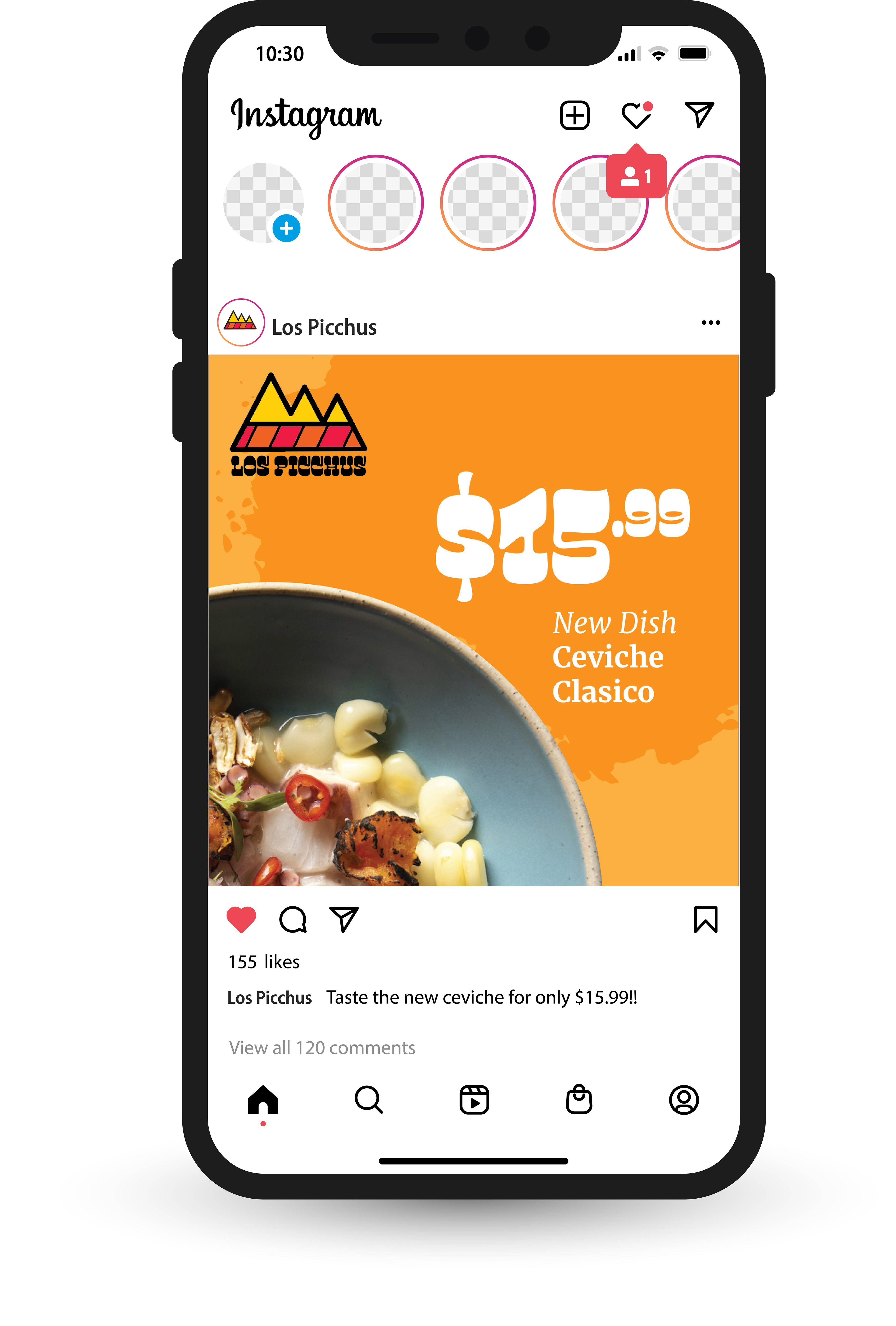
Advertising
I created an ad campaign that promotes and advertises the new dish of the restaurant

Reflection
This project had help me a lot as a designer, the consistency between designs of the brand, research on the brand to know its flaws and find a solution to it, or use the unique selling points and advertise them more.